Replication Replication
Will Lowe
2019-06-25
replication_replication.RmdWEAT (Table 1)
In the following we set the number of permuations to 1000. This means that, although the point estimates should agree with the paper table the p values will be relatively imprecise. To make them more precise change 1000 to a larger number and be prepared to wait a little longer. In most cases the p values is less than 0.0001, so imprecision has no real implications for statistical confidence.
First we’ll load the package and set up some graphics parameters.
library(cbn)

library(ggplot2)
#> Registered S3 methods overwritten by 'ggplot2':
#>   method         from
#>   [.quosures     rlang
#>   c.quosures     rlang
#>   print.quosures rlang
theme_set(theme_minimal())
Flowers vs Insects
its <- cbn_get_items("WEAT", 1)
summary(its)
#> WEAT1
#>   Condition      Role  N
#>    Pleasant attribute 25
#>  Unpleasant attribute 25
#>     Flowers    target 25
#>     Insects    target 25
vecs <- cbn_get_item_vectors("WEAT", 1)
weat_perm(its, vecs, x_name = "Flowers", y_name = "Insects",
          a_name = "Pleasant", b_name = "Unpleasant", 1000)
#>     S_xyab        d p_value
#> 1 2.238165 1.504315       0
Instruments vs Weapons
its <- cbn_get_items("WEAT", 2)
summary(its)
#> WEAT2
#>    Condition      Role  N
#>     Pleasant attribute 25
#>   Unpleasant attribute 25
#>  Instruments    target 25
#>      Weapons    target 25
vecs <- cbn_get_item_vectors("WEAT", 2)
weat_perm(its, vecs, x_name = "Instruments", y_name = "Weapons",
          a_name = "Pleasant", b_name = "Unpleasant", 1000)
#>     S_xyab        d p_value
#> 1 2.290555 1.533989       0
European-American vs African-American Names (1)
its <- cbn_get_items("WEAT", 3)
summary(its)
#> WEAT3
#>              Condition      Role  N
#>               Pleasant attribute 25
#>             Unpleasant attribute 25
#>   AfricanAmericanNames    target 32
#>  EuropeanAmericanNames    target 32
vecs <- cbn_get_item_vectors("WEAT", 3)
weat_perm(its, vecs, x_name = "EuropeanAmericanNames",
          y_name = "AfricanAmericanNames",
          a_name = "Pleasant", b_name = "Unpleasant", 1000)
#>     S_xyab        d p_value
#> 1 1.620779 1.405208       0
European-American vs African-American Names (2)
its <- cbn_get_items("WEAT", 4)
summary(its)
#> WEAT4
#>              Condition      Role  N
#>               Pleasant attribute 25
#>             Unpleasant attribute 25
#>   AfricanAmericanNames    target 16
#>  EuropeanAmericanNames    target 16
vecs <- cbn_get_item_vectors("WEAT", 4)
weat_perm(its, vecs, x_name = "EuropeanAmericanNames",
          y_name = "AfricanAmericanNames",
          a_name = "Pleasant", b_name = "Unpleasant", 1000)
#>      S_xyab        d p_value
#> 1 0.7272336 1.498582       0
European-American vs African-American Names (3)
its <- cbn_get_items("WEAT", 5)
summary(its)
#> WEAT5
#>              Condition      Role  N
#>               Pleasant attribute  8
#>             Unpleasant attribute  8
#>   AfricanAmericanNames    target 16
#>  EuropeanAmericanNames    target 16
vecs <- cbn_get_item_vectors("WEAT", 5)
weat_perm(its, vecs, x_name = "EuropeanAmericanNames",
          y_name = "AfricanAmericanNames",
          a_name = "Pleasant", b_name = "Unpleasant", 1000)
#>      S_xyab       d p_value
#> 1 0.9177094 1.28393       0
Male vs Female Names
its <- cbn_get_items("WEAT", 6)
summary(its)
#> WEAT6
#>    Condition      Role N
#>       Career attribute 8
#>       Family attribute 8
#>  FemaleNames    target 8
#>    MaleNames    target 8
vecs <- cbn_get_item_vectors("WEAT", 6)
weat_perm(its, vecs, x_name = "MaleNames", y_name = "FemaleNames",
          a_name = "Career", b_name = "Family", 1000)
#>    S_xyab        d p_value
#> 1 1.26698 1.813915       0
Math vs Arts
its <- cbn_get_items("WEAT", 7)
summary(its)
#> WEAT7
#>    Condition      Role N
#>  FemaleTerms attribute 8
#>    MaleTerms attribute 8
#>         Arts    target 8
#>         Math    target 8
vecs <- cbn_get_item_vectors("WEAT", 7)
weat_perm(its, vecs, x_name = "Math", y_name = "Arts",
           a_name = "MaleTerms", b_name = "FemaleTerms", 1000)
#>      S_xyab        d p_value
#> 1 0.1989226 1.055015   0.015
Science vs Arts
its <- cbn_get_items("WEAT", 8)
summary(its)
#> WEAT8
#>    Condition      Role N
#>  FemaleTerms attribute 8
#>    MaleTerms attribute 8
#>         Arts    target 8
#>      Science    target 8
vecs <- cbn_get_item_vectors("WEAT", 8)
weat_perm(its, vecs, x_name = "Science", y_name = "Arts",
           a_name = "MaleTerms", b_name = "FemaleTerms", 1000)
#>     S_xyab        d p_value
#> 1 0.345604 1.237453   0.002
Mental vs Physical Disease
its <- cbn_get_items("WEAT", 9)
summary(its)
#> WEAT9
#>        Condition      Role N
#>        Permanent attribute 7
#>        Temporary attribute 7
#>    MentalDisease    target 6
#>  PhysicalDisease    target 6
vecs <- cbn_get_item_vectors("WEAT", 9)
weat_perm(its, vecs, x_name = "MentalDisease", y_name = "PhysicalDisease",
          a_name = "Temporary", b_name = "Permanent", 1000)
#>      S_xyab        d p_value
#> 1 0.5051217 1.382755   0.004
Young vs Old People’s Names
its <- cbn_get_items("WEAT", 10)
summary(its)
#> WEAT10
#>   Condition      Role N
#>    Pleasant attribute 8
#>  Unpleasant attribute 8
#>    OldNames    target 8
#>  YoungNames    target 8
vecs <- cbn_get_item_vectors("WEAT", 10)
weat_perm(its, vecs, x_name = "YoungNames", y_name = "OldNames",
          a_name = "Pleasant", b_name = "Unpleasant", 1000)
#>      S_xyab        d p_value
#> 1 0.3808673 1.212891   0.008
WEFAT (Figure 2)
its <- cbn_get_items("WEFAT", 2)
its_vecs <- cbn_get_item_vectors("WEFAT", 2)
res <- wefat(its, its_vecs, x_name = "AndrogynousNames",
             a_name = "FemaleAttributes", b_name = "MaleAttributes")
head(res)
#>       Word       S_wab
#> 1    Kelly  0.99455943
#> 2    Tracy  0.76497670
#> 3    Jamie  0.07528516
#> 4   Jackie  0.85222977
#> 5    Jesse -0.61802081
#> 6 Courtney  1.10971314
Next we find the gender proportions for each name from the census. In the paper a gender score is constructed from the population proportions (it’s not clear how this was done or where the data came from in more detail than ‘the 1990 US census’). The replication materials bundle these as cbn_gender_name_stats_census1990
data(cbn_gender_name_stats_census1990)
head(cbn_gender_name_stats_census1990)
#>     name gender.score percentage.in.population
#> 1 Adrian       0.7692                    0.039
#> 2 Alexis      -0.4634                    0.020
#> 3 Ashley      -0.9117                    0.159
#> 4 Billie      -0.6047                    0.043
#> 5 Bobbie      -0.7333                    0.037
#> 6  Bobby       0.9307                    0.116
#>   percentage.in.female.population percentage.in.male.population
#> 1                           0.009                         0.069
#> 2                           0.030                         0.011
#> 3                           0.303                         0.014
#> 4                           0.069                         0.017
#> 5                           0.065                         0.010
#> 6                           0.008                         0.223
However, it’s not clear how the graphs x values come out of this data set, so we’ll use instead the gender package, which queries the US Social Security Administration to get the proportion of stated males and females with any particular first name. A version of this data is bundled with the package
data(cbn_gender_name_stats)
head(cbn_gender_name_stats)
#>     name proportion_male proportion_female gender year_min year_max
#> 1   Adam          0.9959            0.0041   male     1932     2012
#> 2 Adrian          0.9268            0.0732   male     1932     2012
#> 3  Agnes          0.0023            0.9977 female     1932     2012
#> 4  Aisha          0.0014            0.9986 female     1932     2012
#> 5  Aisha          0.0014            0.9986 female     1932     2012
#> 6   Alan          0.9968            0.0032   male     1932     2012
We join it to res
and plot the statistic against the gender proportions (converted to percentages)
ggplot(res, aes(x = 100 * proportion_female, y = S_wab, color = S_wab)) +
  geom_hline(yintercept = 0, size = 2, col = "grey") +
  geom_point(size = 5, alpha = 0.9) +
  scale_colour_gradient2(low = "blue", mid = "yellow", high = "red",
                         guide = FALSE) +
  xlim(0, 100) +
  ylim(-2, 2) +
  xlab("Percentage of people with name who are women") +
  ylab("Strength of association of name vector with female gender")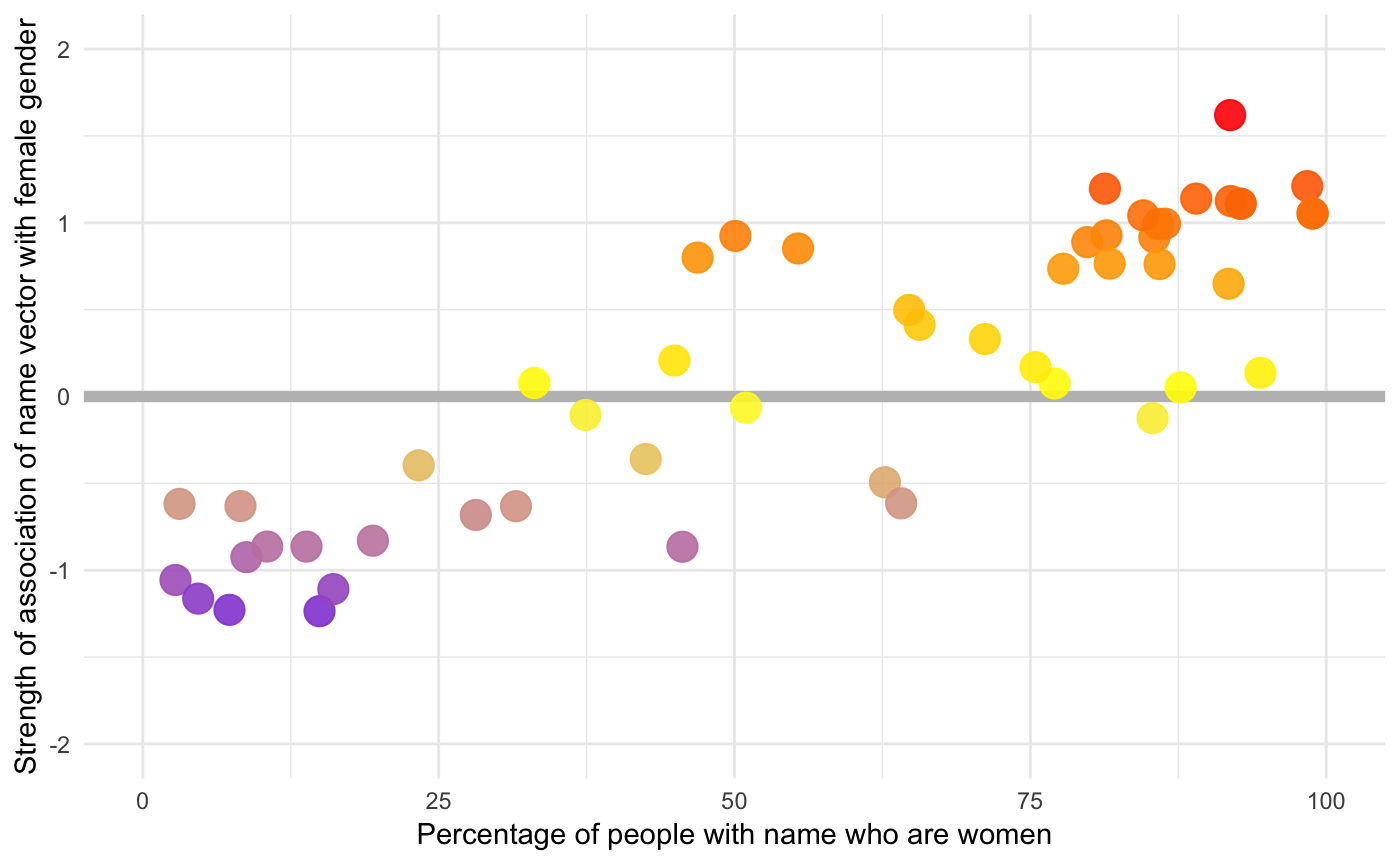
The correlation is
cor.test(res$S_wab, res$proportion_female)
#>
#>  Pearson's product-moment correlation
#>
#> data:  res$S_wab and res$proportion_female
#> t = 11.67, df = 50, p-value = 6.937e-16
#> alternative hypothesis: true correlation is not equal to 0
#> 95 percent confidence interval:
#>  0.7596398 0.9146643
#> sample estimates:
#>       cor
#> 0.8552431
which is a tiny bit stronger than the relationship in the paper.